1
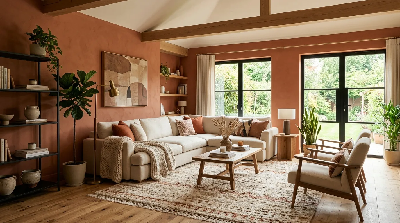
Earthy Terracotta Walls
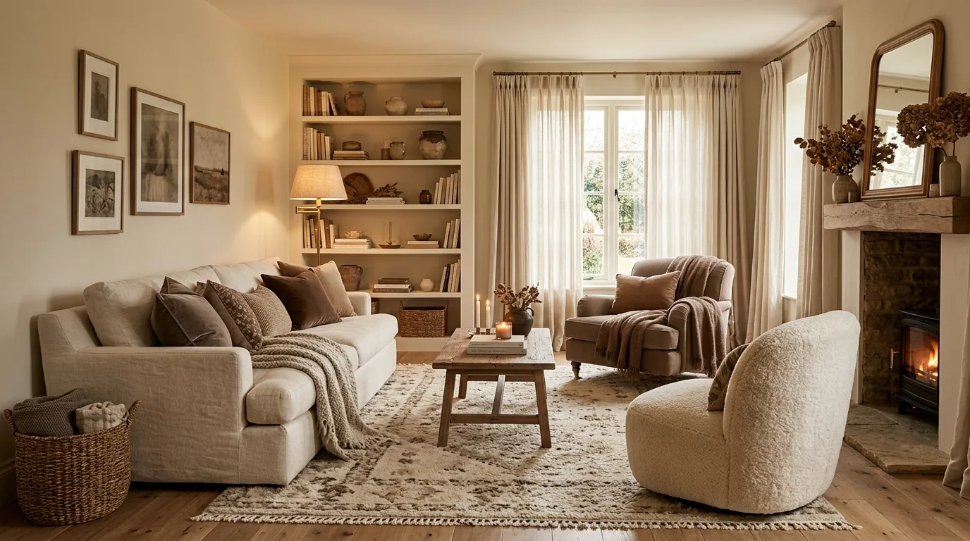
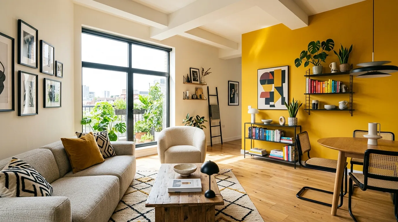
Warm terracotta is showing up as a room-wrapping color that feels cozy, grounded, and more architectural than basic beige. It works especially well with creamy upholstery, wood tones, and black window frames.
These interior color directions for 2026 lean warmer, softer, and more layered, with terracotta, clay, olive, taupe, and creamy neutrals leading the way.
Why This Works
Interior color trends for 2026 are moving away from flat cool minimalism and toward warmer shades that feel more comforting and lived in.
The most inspiring palettes combine natural-looking paint colors with texture, wood, and softer contrast, helping a home feel fresher without losing warmth.
Warm terracotta is showing up as a room-wrapping color that feels cozy, grounded, and more architectural than basic beige. It works especially well with creamy upholstery, wood tones, and black window frames.
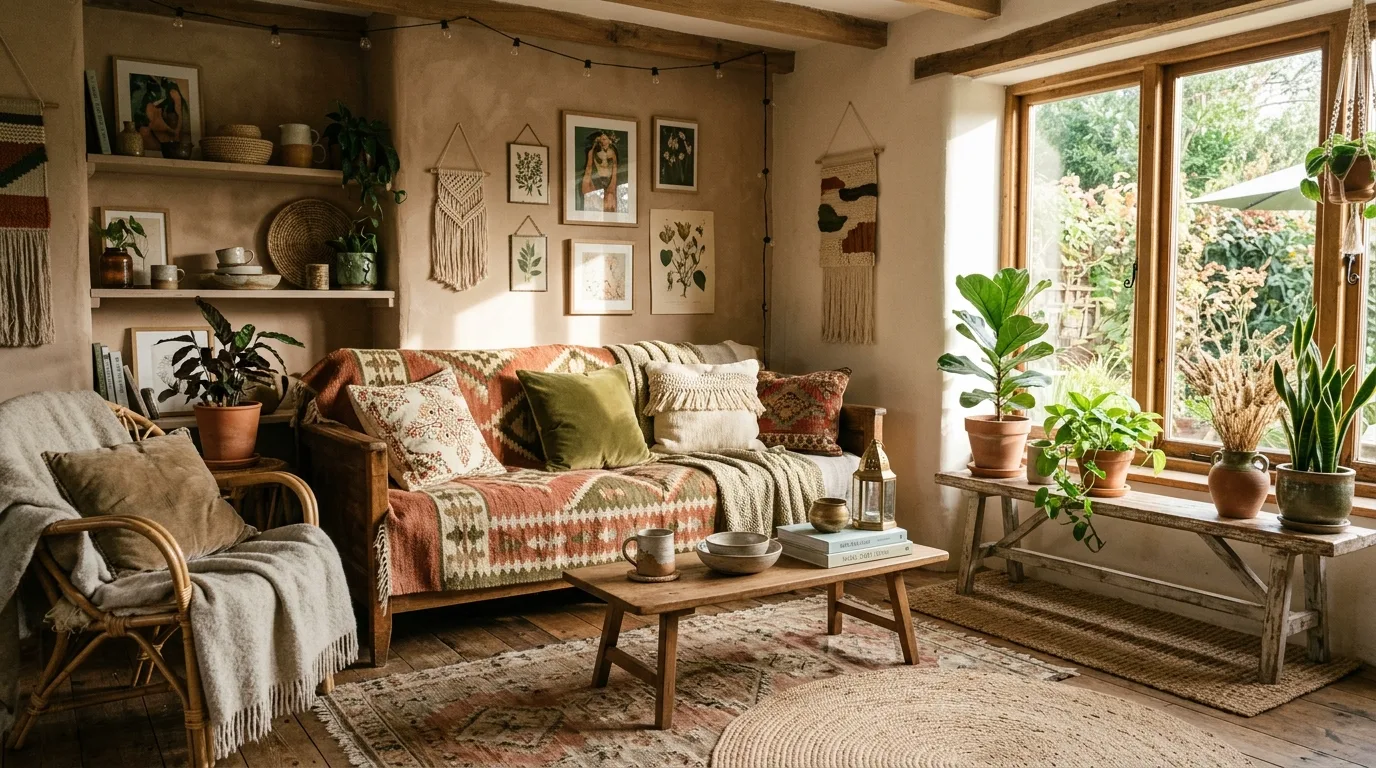
A muted clay tone gives walls depth without becoming too bold for everyday living. It is an easy way to bring warmth into neutral homes that want more personality.
Instead of reading overly sweet, dusty rose can feel quiet and elevated when paired with natural linens, wood, and matte finishes. It softens a room while still giving it a distinct color story.
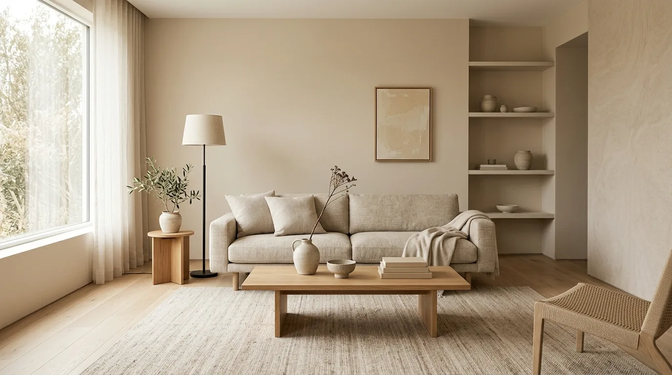
Greige is moving warmer, especially in rooms layered with woven rugs, pale oak, and plaster-like finishes. The effect is polished but still very livable.
Olive green continues to work beautifully in cabinetry, trim, and accent furnishings because it adds color without feeling loud. It pairs naturally with brass, walnut, and stone.
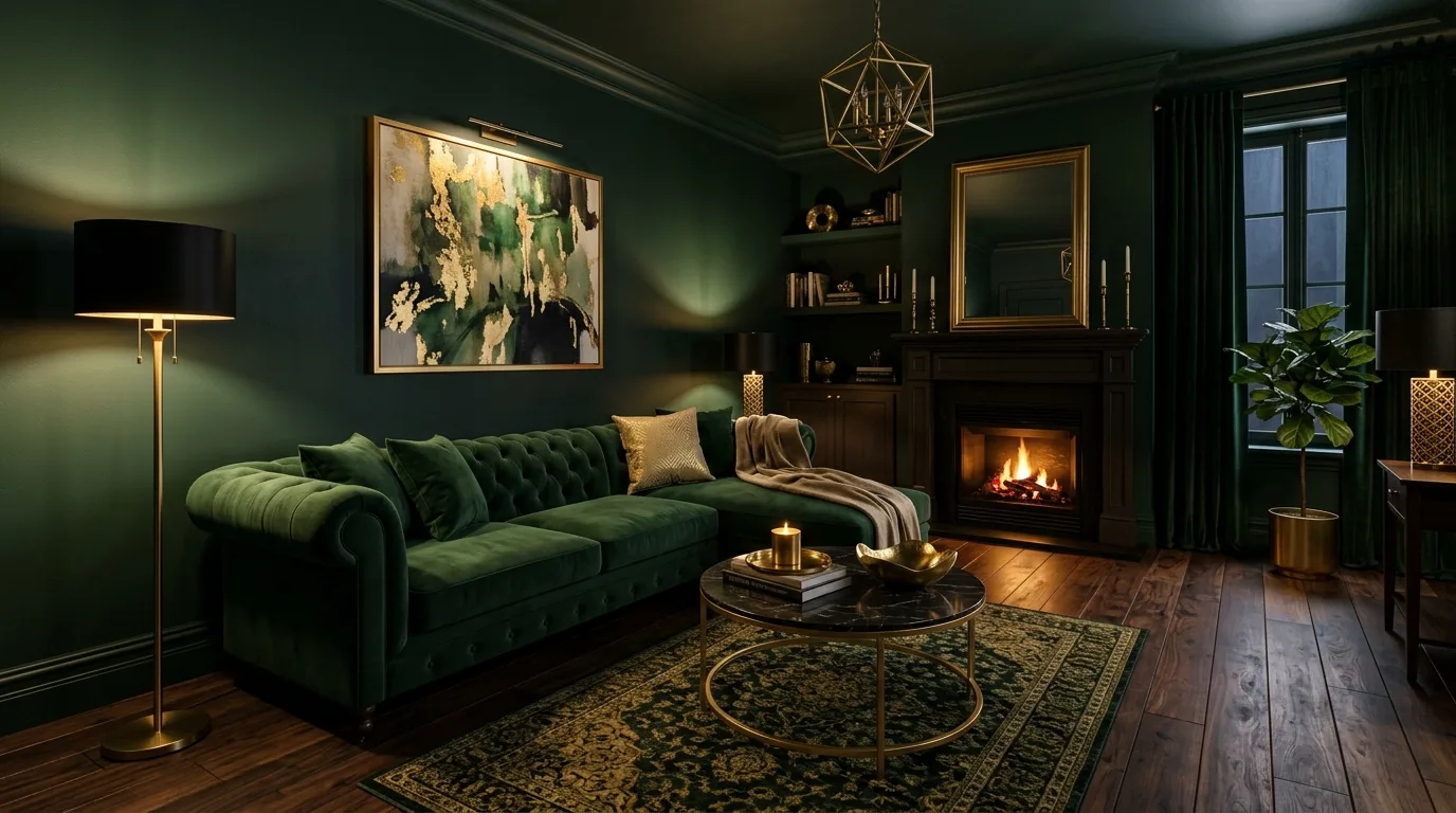
Brown-red and rust tones are being used to create rooms that feel richer and more intimate. They are strongest when balanced with cream upholstery and lighter flooring.
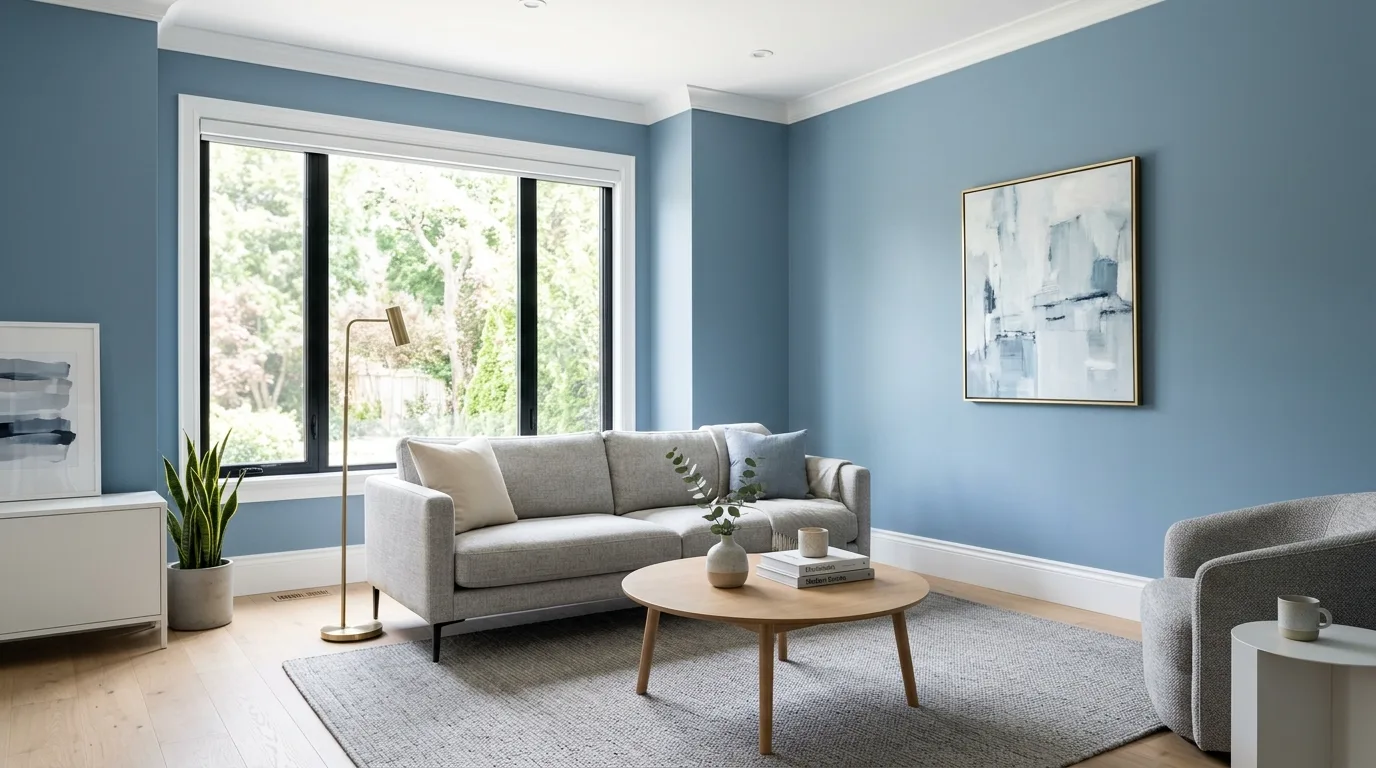
White is not disappearing, but it is shifting away from stark cool shades toward creamier versions with warmer undertones. This keeps interiors bright while feeling much softer.
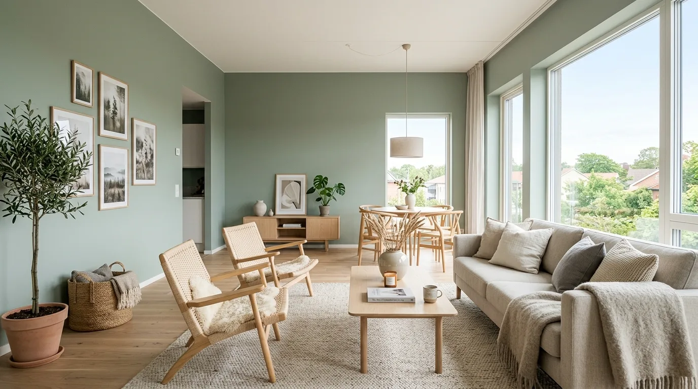
Sage remains useful in bedrooms, offices, and bathrooms because it feels fresh without demanding attention. The newest versions lean softer and more gray than minty.
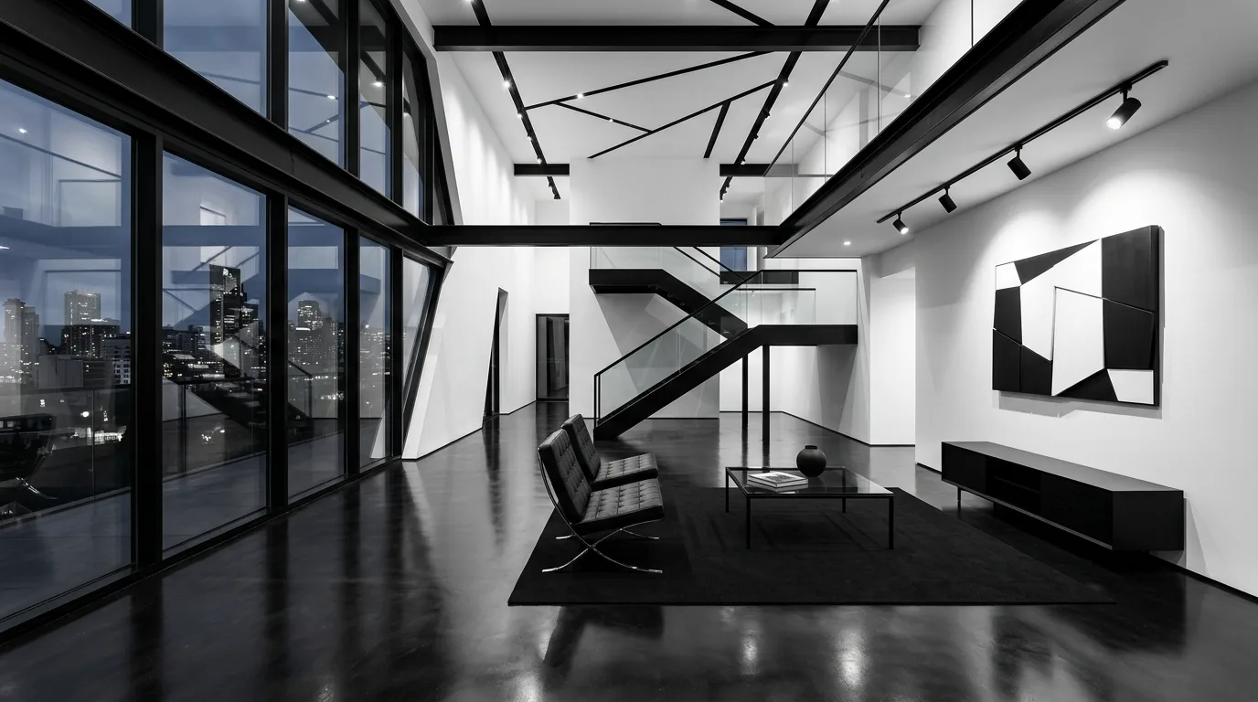
Dark window frames, shelving, and metal details look especially current against warmer wall colors. The contrast gives a room definition while preserving the inviting mood.
Taupe is becoming more interesting when used in multiple depths across walls, upholstery, and rugs instead of as a single flat color. The layered look feels tailored and calm.
Natural sand tones help a room feel open while still adding more character than plain white. They are especially effective in bright living spaces and entryways.
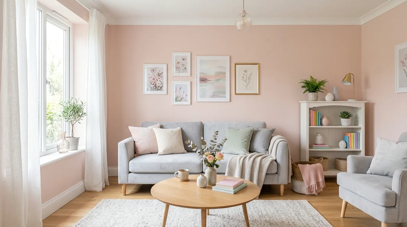
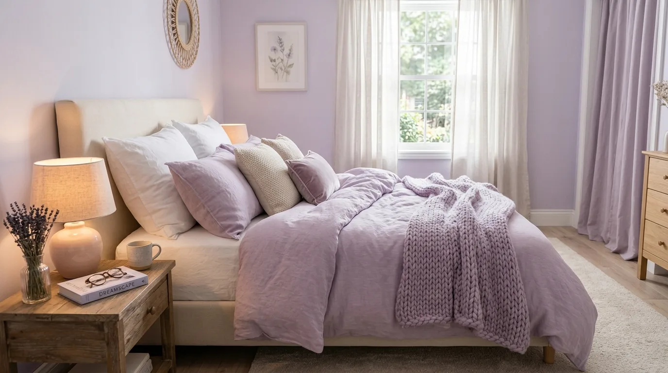
Pale apricot and peach are beginning to replace cooler blush shades in softer interiors. Used sparingly, they make a space feel fresher and more current.
Using one warm tone across walls, trim, and built-ins can make a sitting room or reading corner feel intentional and cocooning. This trend works best in smaller, more intimate spaces.
Many of the strongest 2026 palettes rely on paint and wood working together rather than competing. Warm walls make natural timber look richer and help the whole room feel more considered.
Final Thought
The best 2026 color palettes do not just photograph well; they help a room feel more grounded, welcoming, and complete. Pick one warm direction, support it with texture, and the space will already feel more current.