1
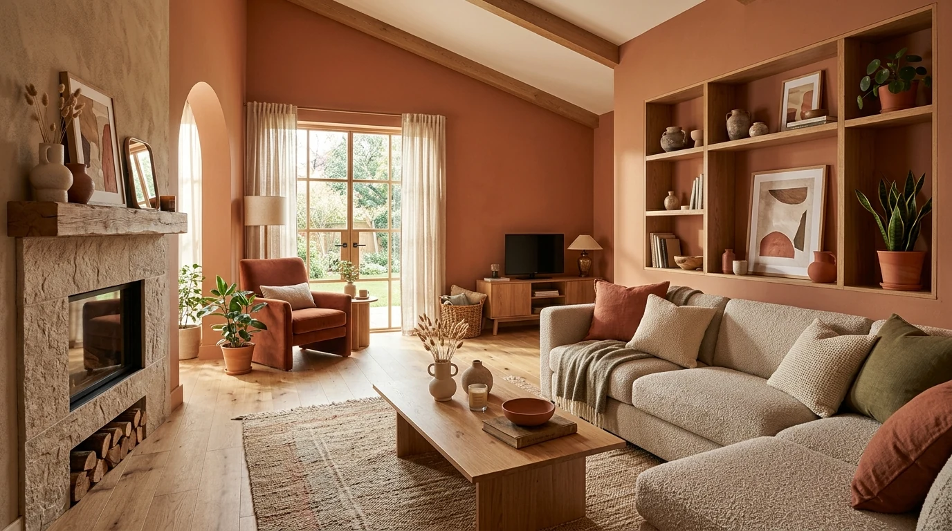
Soft Terracotta with Cream
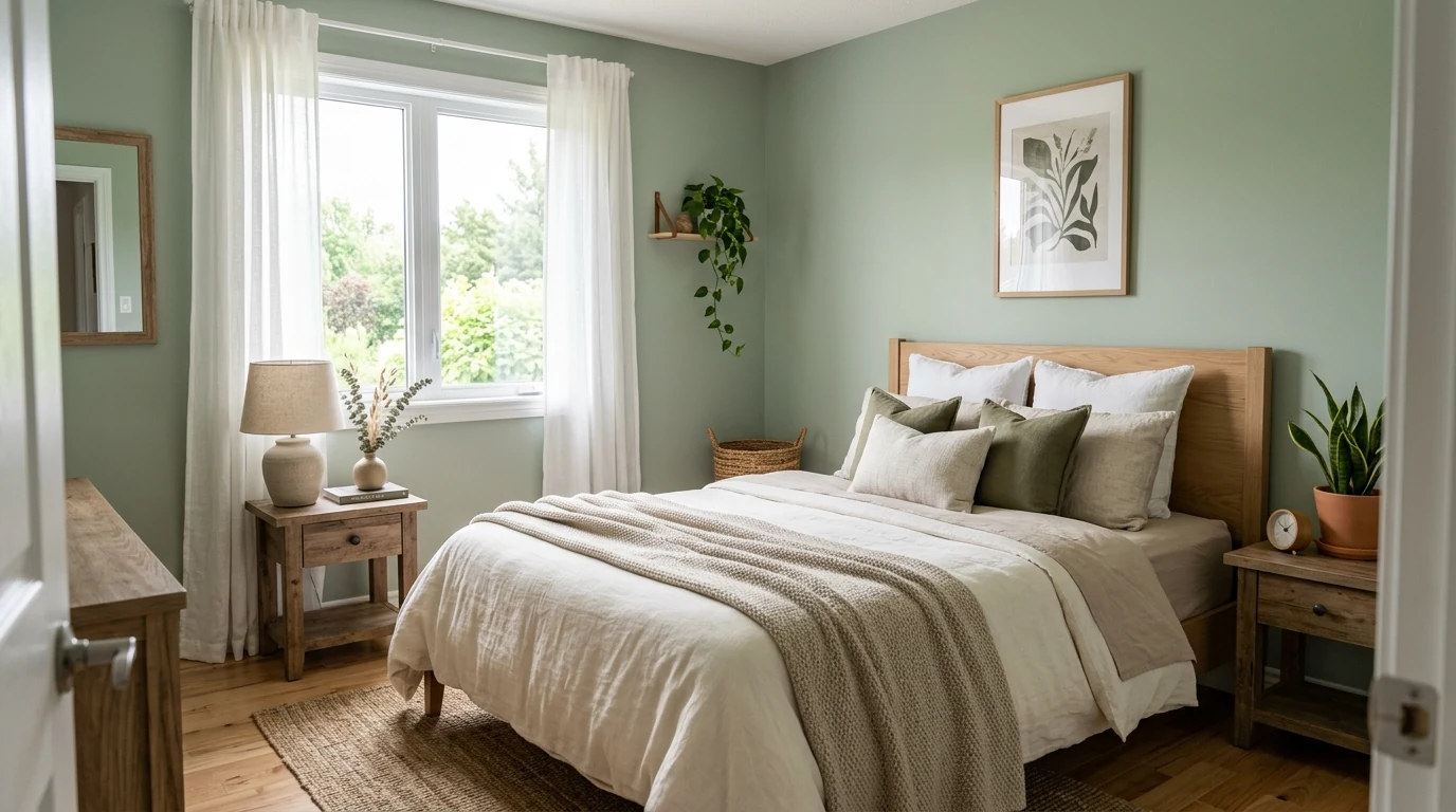
Terracotta paired with creamy neutrals makes a room feel warmer without becoming too dark or rustic. It is one of the easiest ways to make modern spaces feel more grounded in 2026.
These 2026 home color trends lean warmer, softer, and more layered, with clay, olive, taupe, sand, stone white, and muted contrast tones leading the palette.
Why This Works
Interior color trends for 2026 feel less stark and more lived in. The strongest palettes are warmer, more tactile, and easier to layer with natural finishes than the colder minimalist schemes of the past.
These ideas show how current color direction works best when it creates mood first and trendiness second, especially in homes that still want to feel calm and practical.
Terracotta paired with creamy neutrals makes a room feel warmer without becoming too dark or rustic. It is one of the easiest ways to make modern spaces feel more grounded in 2026.
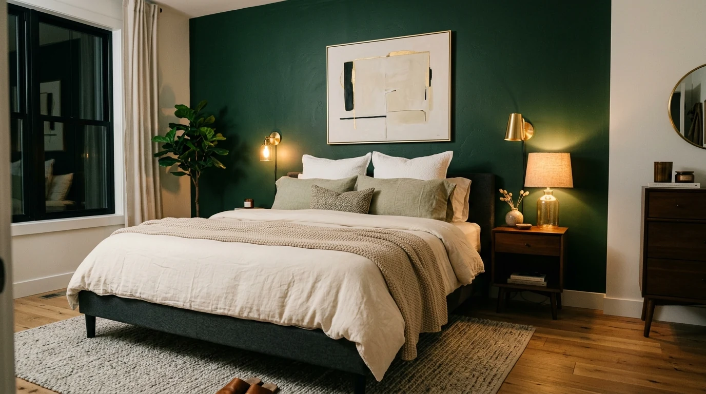
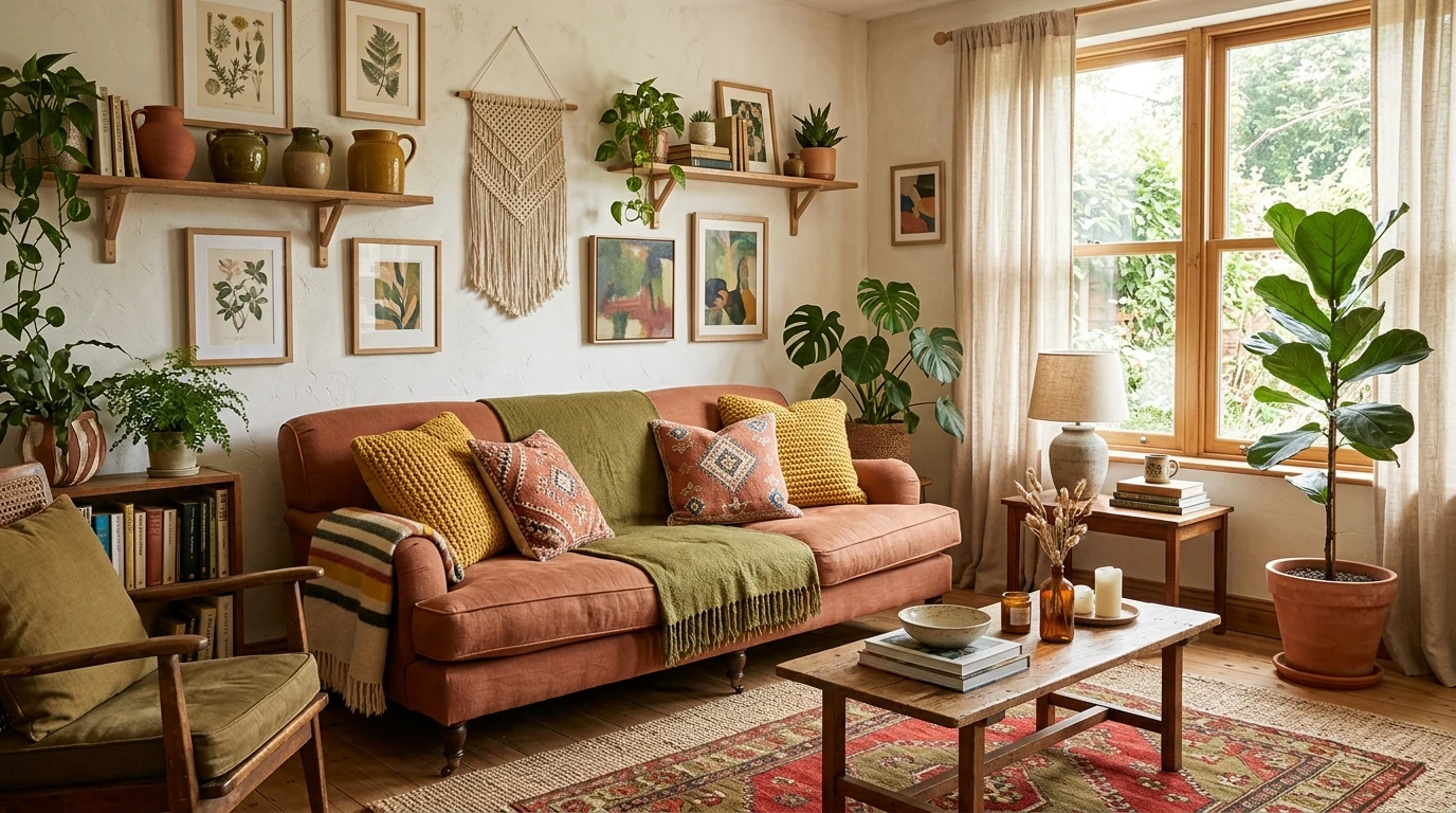
Olive works beautifully when used almost like a neutral on cabinetry, accent walls, or textiles. It gives the room depth while still feeling calm and livable.
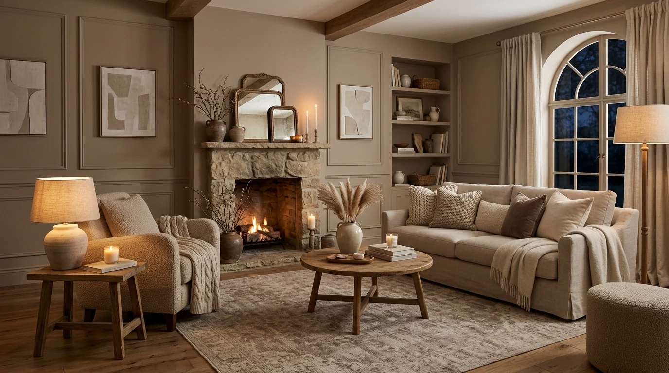
Taupe becomes much more interesting when it is layered across paint, upholstery, and natural materials instead of used in a flat way. The result feels rich, quiet, and very current.
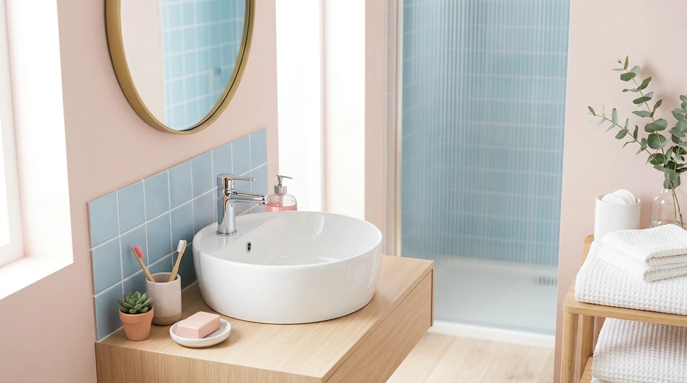
A softened dusty blue gives modern interiors a cooler counterpoint to all the earthier shades trending right now. It feels especially elegant with off-whites, wood, and stone.
Buttery yellow brings optimism into a room without the sharpness of brighter citrus shades. It works best in measured doses through upholstery, art, or painted furniture.
Deep cocoa brown adds weight and sophistication when it is paired with pale walls and lighter fabrics. This contrast makes the room feel more curated and intentional.
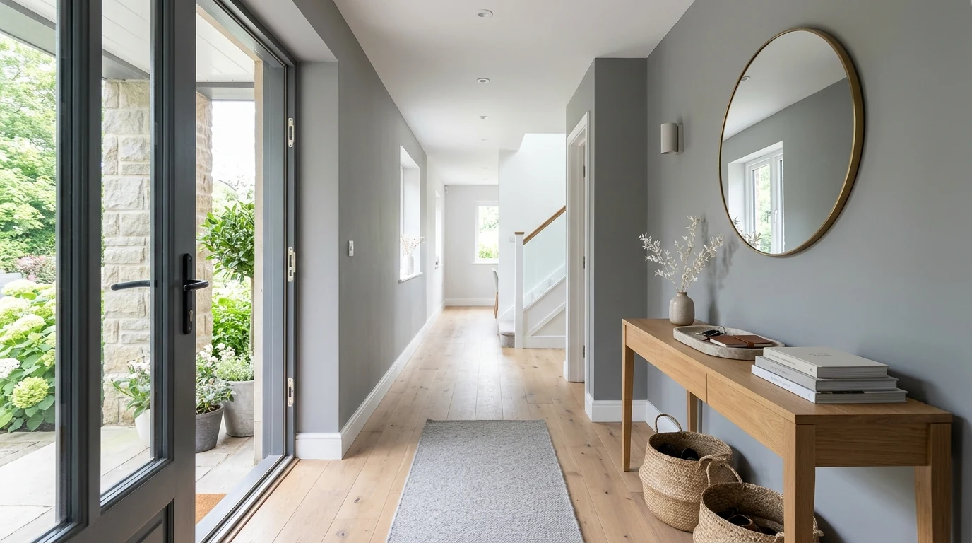
Greige is not disappearing, but it is definitely shifting warmer and softer. The 2026 version feels less flat and works better with brass, wood, and linen textures.
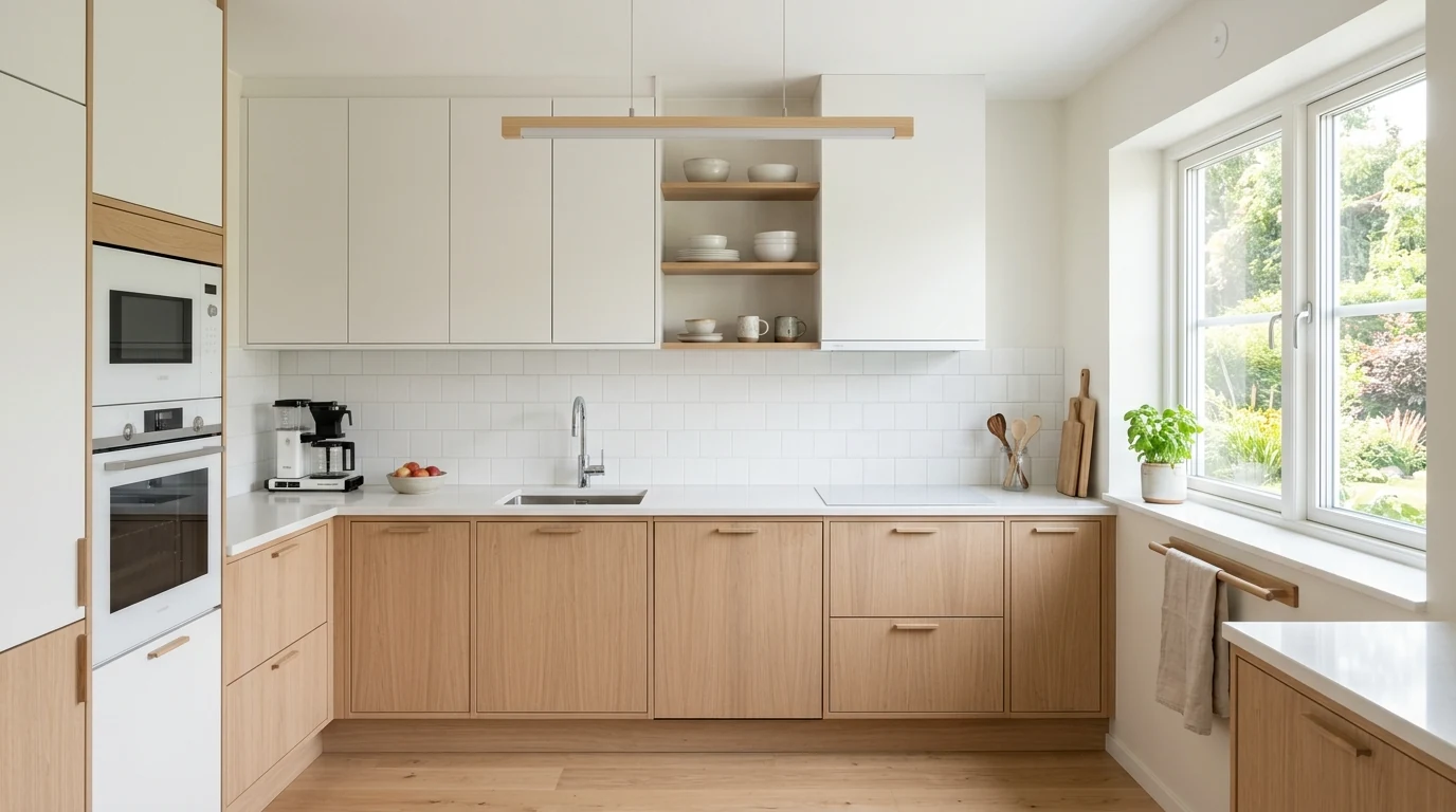
Clay-inspired shades make a kitchen feel more personal while still staying polished. They pair especially well with stone counters and matte hardware.
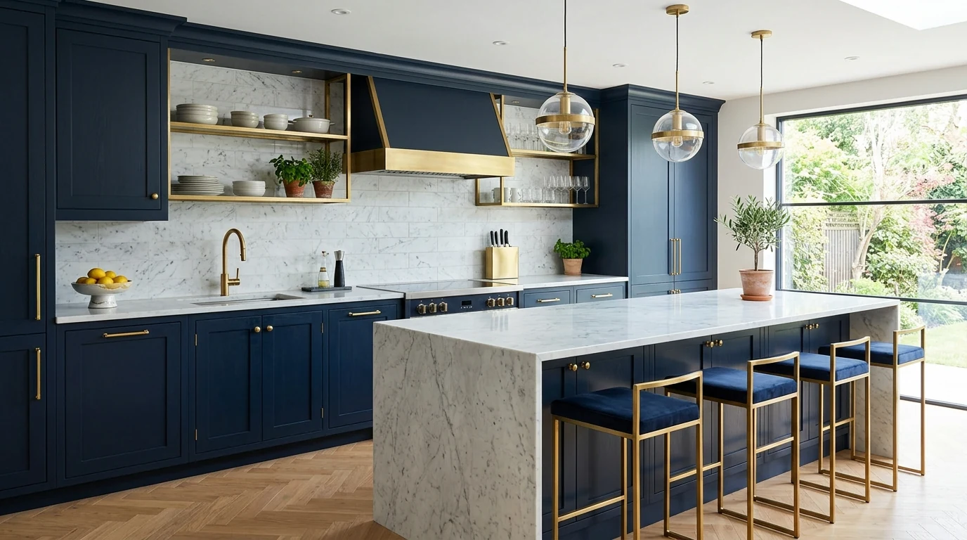
Rather than dominating a whole room, black now works best as a focused accent through frames, lighting, and hardware. It gives the palette structure without taking away softness.
Sage continues to feel relevant when it stays muted and light-sensitive instead of overly sweet. In bright rooms, it creates a calm backdrop that still feels fresh.
Whites are trending less stark and more mineral, with undertones that feel soft beside wood and plaster textures. The room stays bright but gains much more depth.
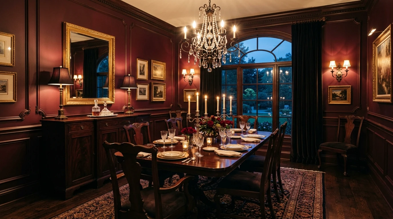
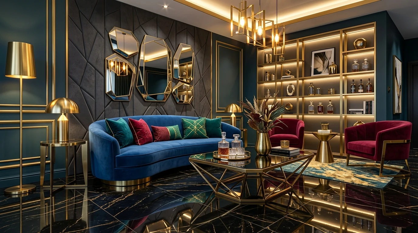
Muted aubergine or plum can make a room feel unexpectedly refined when used in velvet, art, or one painted piece. It is a strong trend when you want something richer than brown.
Sand-toned walls and linen-colored upholstery create a room that feels easy, sunlit, and modern. This palette works especially well in homes that already use natural wood and woven textures.
Color drenching still feels current when the chosen shade is soft enough to live with and the finishes vary in texture. This makes the room feel immersive without becoming heavy.
Final Thought
A modern palette does not need to chase every trend at once. When one or two grounded colors shape the room and the finishes support them well, the result feels current and lasting.