1
Warm Mushroom and Oat Neutrals
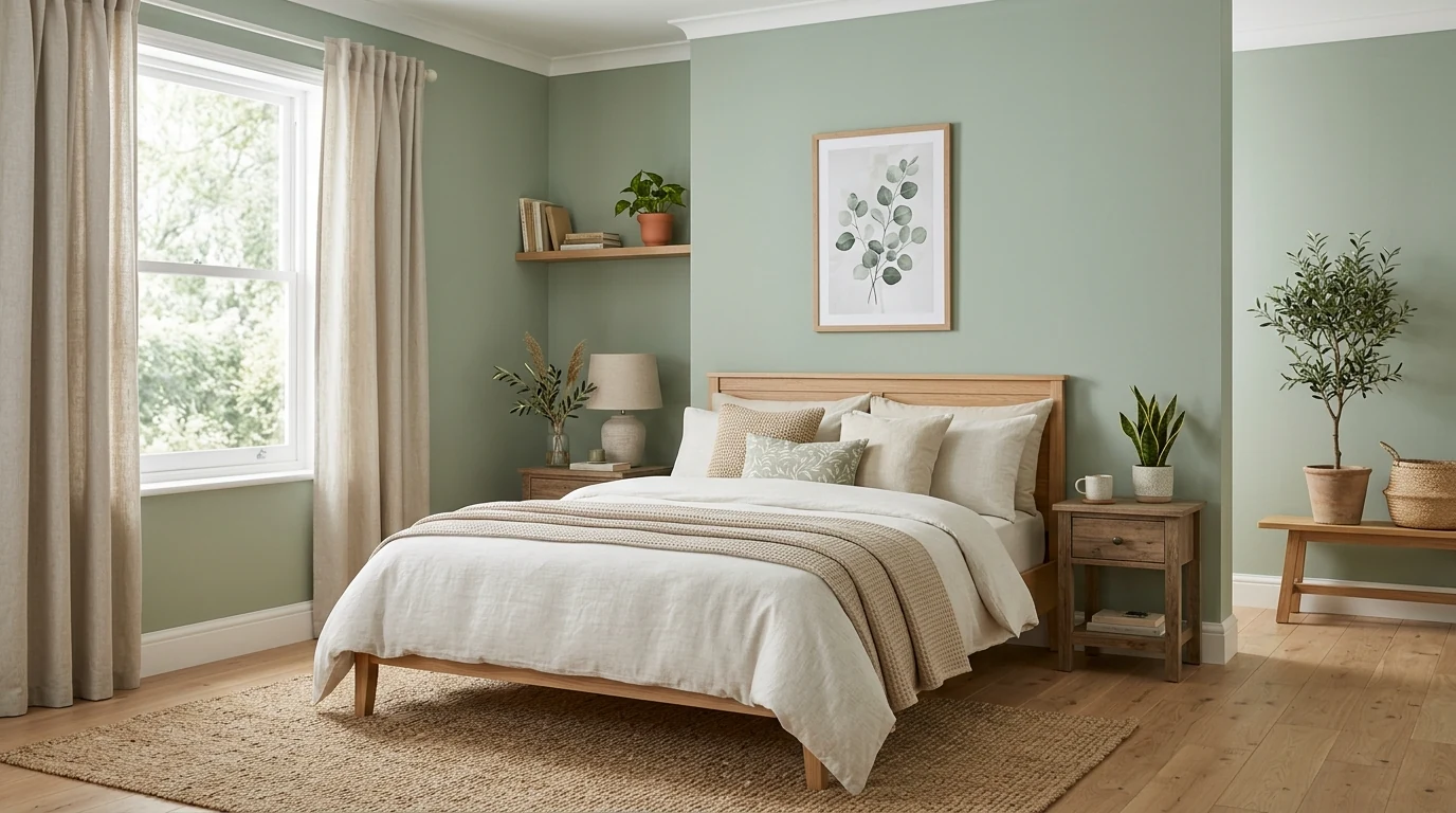
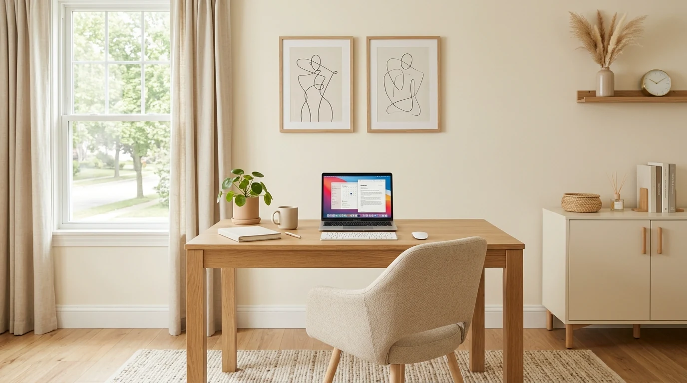
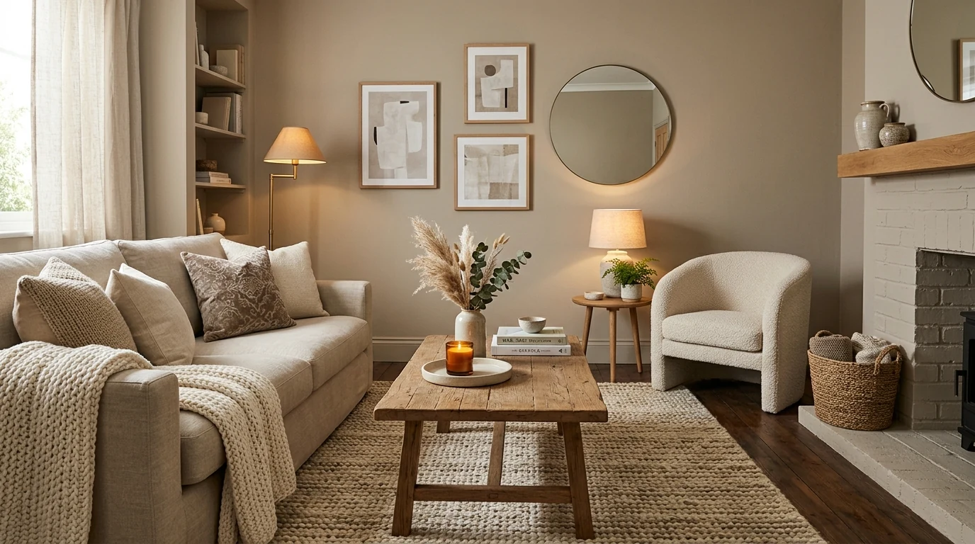
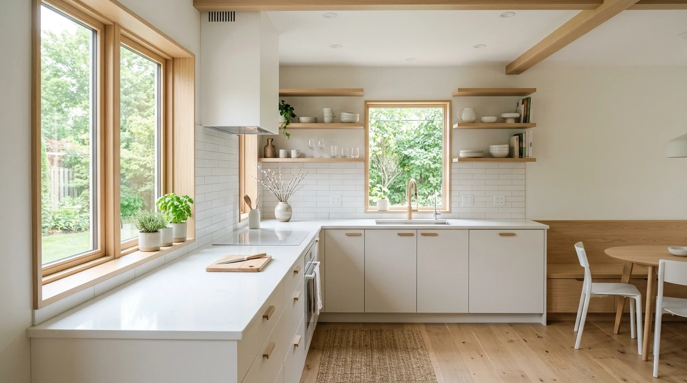
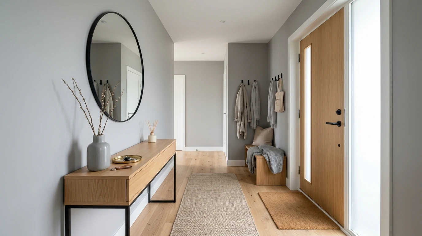
Today’s most useful neutrals feel warmer and more layered than the cooler grays of previous years. Mushroom, oat, and clay-based tones give rooms a softer depth.
These 15 interior color trend ideas cover warm neutrals, earthy greens, soft blues, terracotta, muted pinks, deeper jewel tones, and whole-home palette flow.
Why This Works
Color trends matter most when they help a home feel more intentional and more livable, not just more current. The strongest palettes today tend to feel warmer, softer, and more connected to natural materials than the colder trends of the past.
This guide moves through the shades and combinations showing up most often in stylish interiors, with an eye toward how they actually work in real rooms.
Today’s most useful neutrals feel warmer and more layered than the cooler grays of previous years. Mushroom, oat, and clay-based tones give rooms a softer depth.
Greens continue to work because they feel grounding and easy to live with. The best versions lean muted rather than loud.
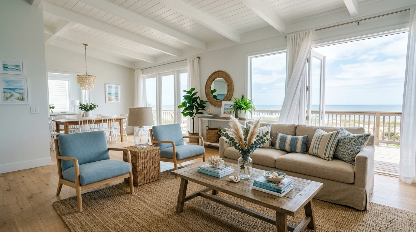
Blue remains strong when it shifts toward airy, softer variations instead of colder tones. It gives interiors freshness without feeling too beachy.
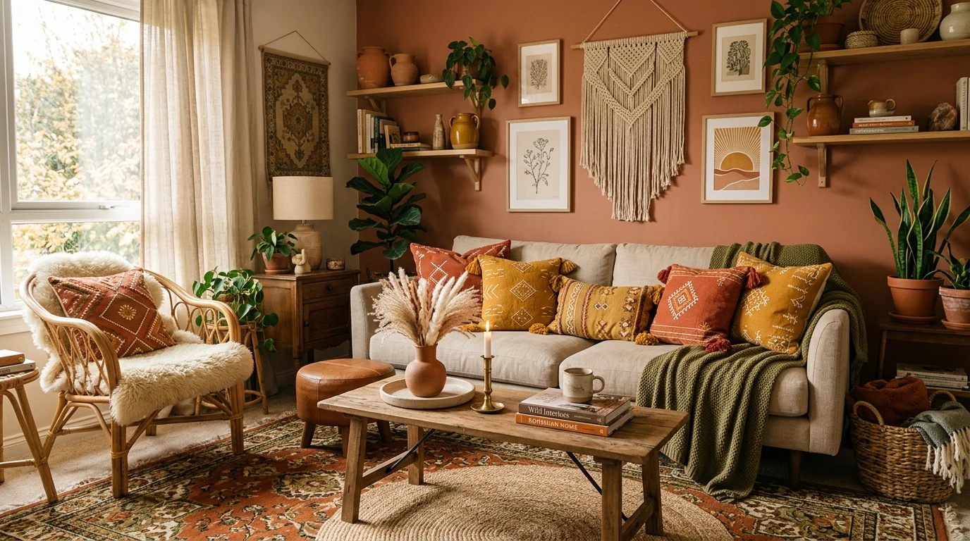
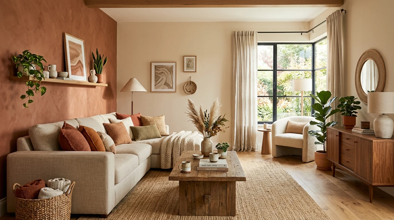
Richer earthy accents can wake up a neutral room without overpowering it. Cinnamon and rust feel especially natural in textiles and smaller furnishings.
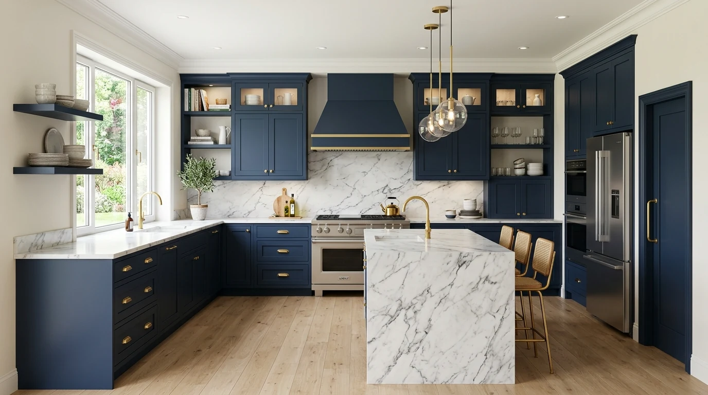
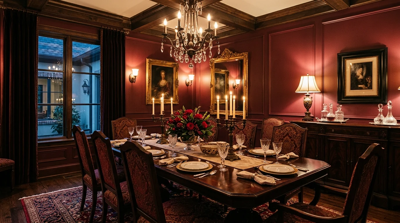
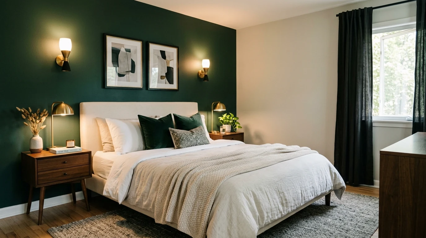
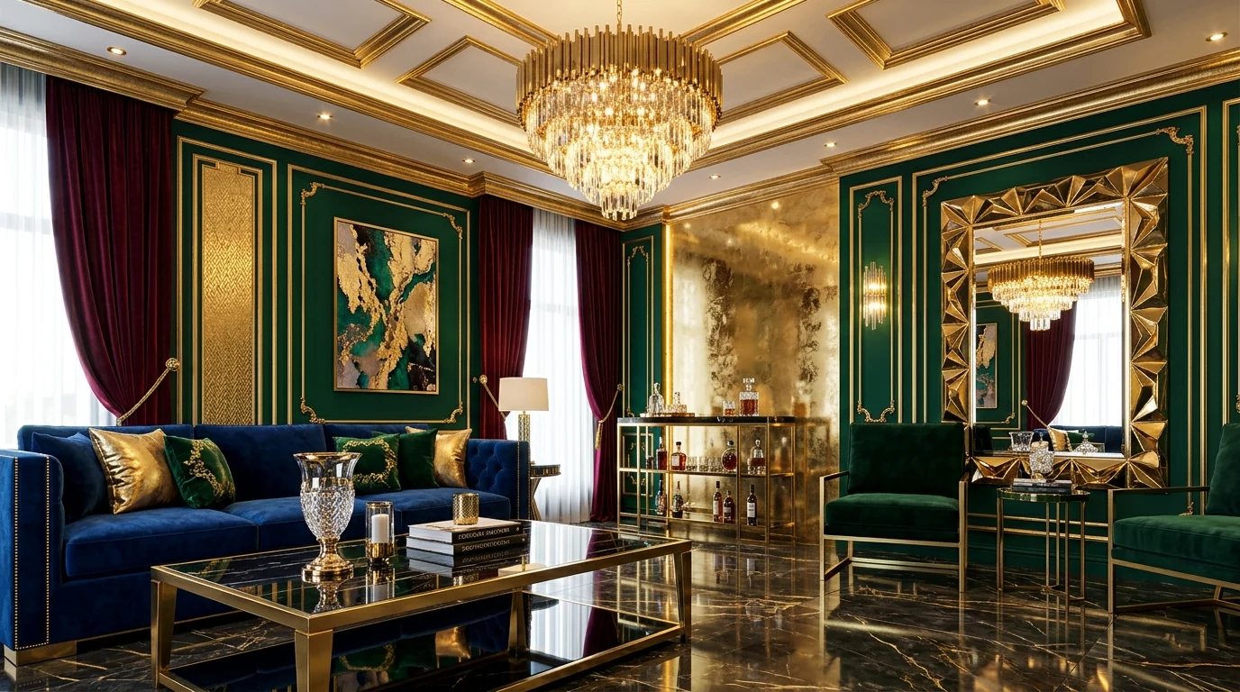
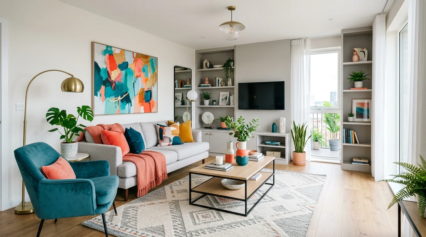
Moodier jewel tones are showing up as statement colors when a room wants more depth. Used carefully, they make interiors feel richer and more designed.
A softer yellow can bring optimism to a room without feeling childish. It works especially well in kitchens, breakfast spaces, and springlike interiors.
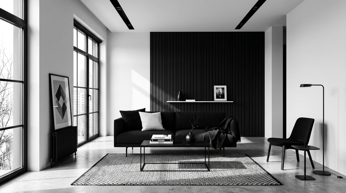
Darker contrast colors still matter because they help lighter palettes feel sharper and more architectural. They are strongest when used with restraint.
Clay-based colors keep showing up because they feel warm, human, and easy to pair with natural textures. They work beautifully in modern as well as rustic spaces.
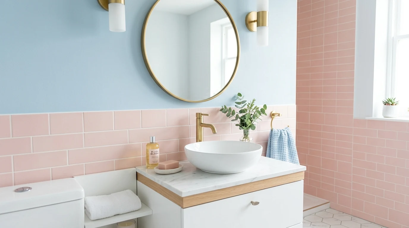
The right pink can act almost like a neutral when it is dusty and warm enough. It adds softness without pushing a room into a sugary look.
One-color rooms feel more interesting when the variation comes through texture and shade instead of contrast. This approach creates a more luxurious atmosphere.
Color trends work best when they complement wood rather than fight it. Warm paint and natural timber are becoming a stronger pairing in current interiors.
Whites are shifting warmer and creamier in many homes because starkness feels less appealing than comfort. The result is bright but still inviting.
Olive mixed with softer stone shades creates a palette that feels very grounded and quietly elegant. It is an easy combination to use across rooms.
People are using color more intentionally through blocked areas and ceilings rather than only feature walls. It helps rooms feel more custom and architectural.
The strongest color trends are really about flow between rooms rather than one trendy paint chip. Homes feel better when the palette shifts thoughtfully from space to space.
Final Thought
The most transformative color trends are the ones that shape how the whole home feels from room to room. When the palette is thoughtful and connected, even a small color update can change a lot.